Post by Matt Matt on Sept 28, 2005 13:51:47 GMT -5
Over the several years that I have been reading and writing English, I have discovered two major facts about it. One, it's stupid, and two, it sucks. I hereby present the guidelines for my suggested upgrade to the English language:

First of all, question marks should be deleted. They're just silly. You know when it's a question. You just know. The question mark character, however, should be kept because it looks funny when you put it by itself on things like signs and hats.
Additionally, anyone writing a question now not only has to delete the question mark, but replace it with the word "PANG" (see fig. 1) because it looks funny. It also makes it more irritating to write, so hopefully people won't ask as many questions and the world will be a happier place.

But, I hear you ask, what are those funny symbols above the text? Well, my response to you is this:
"It's 'Above the text PANG', damnit!"
But I'll let you off seeing as it's Monday. These funny symbols are, for your information, eyebrow punctuation. This helps you read things properly by telling you what to do with your eyebrows as you say the words. For example:

It should be rather self-explanatory.
Now, we've already ditched the stupid question mark, but what about its close friend and accomplice, the exclamation mark? Well, we're going to keep these for several reasons. Firstly and most importantly, two alternate names for the exclamation mark are BANG and 'Pling!' which are both really nice words. Secondly, exclamation marks look nearly as good as question marks in the old hat/sign situation. And thirdly, they are an accurate way of judging a person's intelligence . . .

You see? How can we just throw away a tool as useful as the exclamation mark? Nope, we're definitely keeping it. Oh, and if you feel you absolutely must use more than one, at least tie them up together like this:

Doesn't make such a mess, see?
As we're making such great progress with English 2, I'd like to stop and take some time to show you a previous, failed attempt to improve English, known commonly as American. The idea was to change a few words to make them look stupider, and . . . well, that was it. I must admit, it did catch on and it became very popular. But then so did Communism, dance music and Internet Explorer, so . . . y'know.
In English 2 we will be ending American and reuniting the language. To make up for the years of horrible spelling the poor Americans have been brainwashed into using, words which have had their extra letters re-inserted must be written with these letters really big, or repeated several times, just to piss off Webster. I never liked him much anyway. Any of these will be fine:

All better.
Now read this text here.
Imagine if the whole of this page had been written like that. It'd be horrible. I once read a book where the whole text was written in italics. My eyes went all funny and I went around for the next week with my head at an angle, falling off escalators. If you want to emphasise words and make them stand out, for god's sake just do this:
Crappy italic version:

English-2 version:

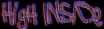
You see? It stands out, you can read it, your eyes will thank you, plus you get little pictures to look at if you get bored. Everyone likes pictures. Of course I realise that if we were using proper English-2 here the sentence should look like this.

I would also like to inform you that long technical documents will now include the new letters ,
,  and
and  sprinkled randomly throughout them to make them that much more interesting.
My next improvement is to get rid of silly words like "cool", "funky" and "tubular" because they're not really very good and tend to go out of fashion really quickly anyway. They will be replaced by the one true word, the all-purpose word, the word of which all other words are mere shadows.

I bet you like it already. You do, I can tell. HAP can mean "That'd be good", "That's happy", "I'm happy", "cool", "funky", "tubular" or "mmm, pie", depending on the context. It never goes out of fashion, is short and easy to spell, is under no risk of being abbreviated or Americanised, and just generally rocks.
And finally, the last line of a document should be underlined and have a little wheel coming out of it. This is so you can tell where the end is and don't start looking on the back or on other random bits of paper to see if you missed a bit. Plus it makes it more portable.

First of all, question marks should be deleted. They're just silly. You know when it's a question. You just know. The question mark character, however, should be kept because it looks funny when you put it by itself on things like signs and hats.
Additionally, anyone writing a question now not only has to delete the question mark, but replace it with the word "PANG" (see fig. 1) because it looks funny. It also makes it more irritating to write, so hopefully people won't ask as many questions and the world will be a happier place.
But, I hear you ask, what are those funny symbols above the text? Well, my response to you is this:
"It's 'Above the text PANG', damnit!"
But I'll let you off seeing as it's Monday. These funny symbols are, for your information, eyebrow punctuation. This helps you read things properly by telling you what to do with your eyebrows as you say the words. For example:
It should be rather self-explanatory.
Now, we've already ditched the stupid question mark, but what about its close friend and accomplice, the exclamation mark? Well, we're going to keep these for several reasons. Firstly and most importantly, two alternate names for the exclamation mark are BANG and 'Pling!' which are both really nice words. Secondly, exclamation marks look nearly as good as question marks in the old hat/sign situation. And thirdly, they are an accurate way of judging a person's intelligence . . .
You see? How can we just throw away a tool as useful as the exclamation mark? Nope, we're definitely keeping it. Oh, and if you feel you absolutely must use more than one, at least tie them up together like this:
Doesn't make such a mess, see?
As we're making such great progress with English 2, I'd like to stop and take some time to show you a previous, failed attempt to improve English, known commonly as American. The idea was to change a few words to make them look stupider, and . . . well, that was it. I must admit, it did catch on and it became very popular. But then so did Communism, dance music and Internet Explorer, so . . . y'know.
In English 2 we will be ending American and reuniting the language. To make up for the years of horrible spelling the poor Americans have been brainwashed into using, words which have had their extra letters re-inserted must be written with these letters really big, or repeated several times, just to piss off Webster. I never liked him much anyway. Any of these will be fine:
All better.
Now read this text here.
Imagine if the whole of this page had been written like that. It'd be horrible. I once read a book where the whole text was written in italics. My eyes went all funny and I went around for the next week with my head at an angle, falling off escalators. If you want to emphasise words and make them stand out, for god's sake just do this:
Crappy italic version:
English-2 version:
You see? It stands out, you can read it, your eyes will thank you, plus you get little pictures to look at if you get bored. Everyone likes pictures. Of course I realise that if we were using proper English-2 here the sentence should look like this.
I would also like to inform you that long technical documents will now include the new letters
, and sprinkled randomly throughout them to make them that much more interesting.My next improvement is to get rid of silly words like "cool", "funky" and "tubular" because they're not really very good and tend to go out of fashion really quickly anyway. They will be replaced by the one true word, the all-purpose word, the word of which all other words are mere shadows.
I bet you like it already. You do, I can tell. HAP can mean "That'd be good", "That's happy", "I'm happy", "cool", "funky", "tubular" or "mmm, pie", depending on the context. It never goes out of fashion, is short and easy to spell, is under no risk of being abbreviated or Americanised, and just generally rocks.
And finally, the last line of a document should be underlined and have a little wheel coming out of it. This is so you can tell where the end is and don't start looking on the back or on other random bits of paper to see if you missed a bit. Plus it makes it more portable.